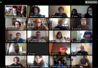
Since the outbreak of Covid-19, almost everything in business has been switched to an online experience. However, people are already overwhelmed by several Zoom meetings, webinars and events all day with a lot of constraints at home. As a strategic design consultancy, we have attended several online calls, webinars, conferences, and meet-ups to get an understanding of their design and user experience. We have experienced that brands mainly focus on what they want to say and miss the opportunity for interaction with their audience. However, this is a completely new context and experience with a lot of constraints and requires a new mindset..
Here are our 10 tips for designing online calls, events or webinars. You can simply use the guideline to imagine how an online meeting, an event or a webinar can be.
We also invite you to view our webinar recording Designing Online Events, in case you missed it!
 1- Context
Context is by far the most important factor when you design anything new. It could be a product, a service, a strategy or an event, etc. Context is simply the external elements that influence the use of what you want to design. Therefore, you need to consider your language, tools that you use, interactions and simply everything around your subject, what’s happening in the world right now, people’s physiology for your design. So, start to define what your context is in detail. This is crucial.
 2- Start from Scratch
Don’t try to copy from your offline meetings, events or even TV, YouTube or any online experiences before the outbreak. An online experience in this “new” world is a new experience – starting from scratch. For TV, YouTube or anything online before the outbreak was consumed when people had the chance to do offline things as well. Now, it is much more challenging, as people are already overwhelmed by webinars and calls. Because of the current conditions, everything is new. Come up with new ideas and design a new experience.
 3- Facilitation
Facilitation is a separate task and not easy at all. You should know your tool very well. In addition, your language and tone should very much be aligned with your topic and brand. Your tone should be suitable for the home environment as well. Be encouraging and welcoming.
You need at least two people for facilitation: One person should facilitate the talk, while the other should facilitate interactions, questions, and chats. Make sure that you have a chat policy as some people may share content that you may not want, such as adult content, promotions, sales pitch etc.
 4- Be Brief
People have a lot of things to do. They have kids. They need to cook. They need to take care of their older relatives. And most importantly they are tired of webinars and online calls. Be brief and try to provide valuable things that contribute to work and life. Whatever your content is, try to do it in half the time of what you had planned.
 5- Time Differences
With remote work, where you are located is not important anymore. Country borders or your travel budget cannot affect your participation. However, your time zone is the new border. When you organize online experiences, you must be careful with your target audience’s time zones. This is not a 1-2 day experience. People may live in the now for years. So, set your design right in the beginning with these new conditions. Remember to respect people’s family time, lunch break and holidays in different zones and countries.
 6- Authenticity
When people worry about their health and their loved ones, your language and style should be as authentic as possible. People wouldn’t tolerate spuriousness.
 7- Tools
People’s experience and feelings are important and should be at the center of your design. However, the tool that you use can bring a completely new experience and limit what you can do. Some tools and their functionalities allow you to create more interactions. The tool should be also aligned with your brand experience as much as possible. For example, Microsoft Teams, Cowcast can be used for large corporate events whereas Zoom and Bluejean can be more suitable for small groups.
 8 – Attention Span
Even if your participants are looking like they are paying attention online, it does not mean that they are listening to you. You shouldn’t forget that attention span is much lower than in-person meetings or calls before the outbreak. Be brief and also from time to time check if people are in sync with you.
 9 – Background
We have seen people use animation on their backgrounds in their webinars. Please don’t, unless they are there for a specific purpose. They are disturbing. Go simple as much as possible, at least for now. Everybody knows that you work from home.
 10 – Coronavirus
No matter what you do, you shouldn’t forget that we are going through a pandemic. Keep asking people how they are doing and whether they need anything. Business is business, but human relations and solidarity should come first no matter who you are and which brand you represent.

